A Few Gold Charts (Waiting for the Next Great Bull Market)
With the gold price haven risen recently, it's a good time to take a look at a few charts and also discuss some basic chart construction / philosophy.

Essentially all of the charts constructed here are based around a few basic ideas:
Prices, among other things, are cyclical;
Price encapsulates fundamental analysis - in other words, price takes into account all analysis and opinions held by the "market" about a particular commodity - in this instance gold;
There are natural growth patterns and declines that can be expressed by lines drawn at particular angles on a price chart - these angles can vary depending on what is being looked at - stock market, gold, silver, etc.;
Lines should be drawn on the chart in a way that eliminates bias as much as possible - that's why lines drawn at particular angles are preferable to other lines that may reflect a certain point of view;
Layering different types of analysis on the same chart can help show different levels of support and resistance which can help explain price movements that otherwise appear random, e.g., price appears to "float" then "reverse" between two different levels
There is more behind the charts you'll see here than outlined above. Some of it relates to deeper issues of how the universe works, but we're not going to get into that here.
So, back to our first chart...

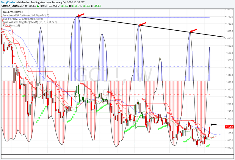
Above is a weekly gold chart. The blue and red spikes are an oscillator. Those blue spikes have been gradually becoming shorter and price has been trending lower. There also has been an alternating pattern of larger and smaller oscillating spikes to the upside.
Until those oscillations higher break above the trend line drawn on the chart it appears likely the overall price trend will remain to the downside.

The next chart contains the first chart along with some additional indicators. Basically, these indicators are a fancy way of getting at the same questions. What is the direction of the gold price? How strong is the momentum?
The answers are pretty simple. The price trend remains down. The momentum is fairly weak. For example, the DMI/ADX/KEYLEVEL shows the current price trend is up (blue line crossed above grey). However, the red line remains well below 25 which indicates weak momentum. If you look at the indicator above it (the Squeeze Momentum) it paints a similar picture.
Another interesting feature (visible on the first and second chart) is the Supertrend. You'll see a black arrow drawn in pointing at a red line. The red line signifies that the overall trend in the gold price is currently down. However, if the price gets above around $1,163, then the trend should change to up instead of down. Now, that doesn't mean that the gold price will take off to the moon, but it would mark the first reversal higher since the Supertrend turned down in March of 2015.

Another way of viewing the same resistance level(s) is seen above. The $1,138 - $1,144 levels had provided resistance for some time. Once that resistance was broken the next levels came into play at around $1,161 - $1,169. Now, the $1,169 line isn't a particular neutral or unbiased line. It was more or less placed on the chart by just "eyeballing"it. But, the line has held up pretty well since October 2014, acting as first support, and then resistance.
More important is the small red cross (price pivot) just above the horizontal black line drawn as $1,161.20. That red cross is the final monthly resistance level not broken by the gold price for February 2016. It sits at the $1,168.80 level. Above it remain only yearly price pivots at $1,229.93 (red) and $1,244.53 (appropriately, gold).
The current uptrend in the gold price shouldn't be too surprising as it largely conforms with gold's seasonal pattern. That takes nothing away from what has, thus far, been a solid move higher. By the same token, if the seasonal pattern is typical, then the gold price could dip later in February into the beginning of April. Only time will tell.

The next chart, not surprisingly, shows a similar resistance level around $1,164.50. Above that are three black lines showing resistance near $1,262.80, $1,336.60 and above $1,400.00. To really consider the overall trend lower broken, even temporarily in the longer term, price would have to break and stay above the black line drawn at a 52 degree angle from the all-time high price for gold at $1,920.80. So, while a move from below $1,050 to near $1,400 would be a significant one, it only represents a necessary but not sufficient move to reverse the overall bear market in gold.

If we step back and look at the trend in gold, one view is that the price has been travelling within a downward channel - in this case a regression channel. The gold price could bounce up to around $1,256 and still be within the channel. You may have noticed that the price has stayed mostly below the channel mid-line since the beginning of 2015, so the overall price action appears rather weak.
On the other hand, if you look at the Fibonacci Speed Fan Levels, price recently crossed from below the 0.382 level to above it again. That could be viewed as a positive. But, if you look closely at the chart you'll see price has crossed below and above certain levels only to ultimately fall again and continue lower.

Another view of where gold has been and where it is going is above. There is a lot going on with the chart - it's a bit busy. However, the most important lines are highlighted by the four red arrows. Running from top to bottom we have:
A 26 degree line (gold) drawn from the $1,920.80 high price. The line basically represents a natural growth and / or decline rate;
A 7 degree line (blue) drawn from the $101 low back in 1976. You can see where this line has acted as support and resistance at various times. The gold price re-tested this resistance in February 2015 but ultimately failed to stay above it which marked the beginning of a fairly steep decline in price;
A 39 degree line (red) drawn from the $1,920.80 high price. 39 degrees seems to be one of the natural lines seen in decline. 52 degrees, as you will see later, is another. The price has recently breached above this line and could indicate at least a temporary trend to the upside;
A 13 degree line (red) drawn from the $681.00 low back in 2008. The gold price has found support here several times
Overall, gold has the look of still being in a downtrend. The price break above the red line drawn from the 2011 high could mean a price reversal higher (most likely temporary).
The gold price could move through the blue line drawn from the 1976 low without changing the overall trend. Only when the price breaks above the gold line drawn from the 2011 high (around $1,400 currently) could we begin to consider that the downtrend in place since 2011 might be broken. But, even a move through $1,500 and up to $1,600 might prove to be a big head fake before a more significant move lower.
Looking back at the 1970's to 1980 high in the gold price there are certain similarities in the chart that bring up an interesting possibility.

First off, it's hard not to notice that the 1970's to 1980 move up in the gold price just has a similar look to it. It's almost as if the 1970's to 1980 move is the little brother to the more recent bull market in gold.
The price decline angle from the 1980 high is steeper - 52 degrees versus 39 degrees for the current decline.
You also see that during the 1980's gold managed to break through the resistance line, but the move from breaking resistance to it's high point was only about 20% higher.
A similar move from where price broke above the red resistance line now would take gold up only to about $1,320. If the pattern similarity held gold could face several years of choppy sideways trading going out to around 2019 (again if the pattern held) followed by many years (14-15 from 1985 to 1999 after the 1980 top) until gold reaches a final bottom.
Now, none of that is to say that is what will happen. It's a lot to assume an identical or near identical pattern.

However, a case can be made based on Alan Andrews' Action-Reaction Principle that may well continue its overall trend down into 2019 and beyond. While the chart considers the possibility of gold dipping below $1,000 by 2019, an equally plausible scenario would be for gold to trend higher to over $1,300.00 before reversing somewhere around 2019. Gold then potentially might move sideways until 2023 before making its way to its ultimate low around 2032. 2032, like 1999 was, would be the start of the next great bull market. Time, ultimately, will tell which way the gold price will move and when the next great bull market will begin.
Chart Analysis uses a combination of technical analysis and cycles to provide insight into the future direction of precious metals, currencies, stock indices and more.

