Deny the Decline
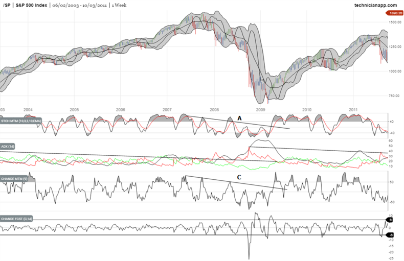
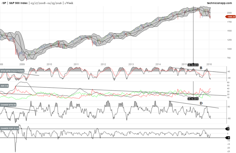
It's hard to deny the stock market decline and to try and pretend it's going to be OK. While this decline is not 2008, it is still useful to take a look at the 2008-2009 decline vs. the 2015 to present one.


Just compare the stochastic momentum indicator at A in 2008-2009 to the one at B in 2015 to present.
Then look at the Chande Momentum Indicator at C in 2008-2009 and compare it to the situation at D from 2015 to present.
The market has the look of rolling over and those lines drawn sloping downwards over the indicators will clearly indicate at some point in the future when the momentum to the downside has been reversed.
Another interesting point to note - although it hasn't been marked up on the chart - is the Chande Forecast Indicator. Notice how during the steady bull market climbs upward it hung pretty close to the zero line. However, the indicator becomes more volatile as the market starts to break down. While we're not quite there yet, look for this indicator to become more volatile, breaking above and below the black horizontal lines, as yet another indication that the bull has become a bear.
Chart Analysis uses a combination of technical analysis and cycles to provide insight into the future direction of precious metals, currencies, stock indices and more.
