DJIA Angles 1932, 1974

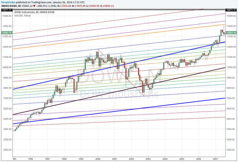
There is an interesting pattern setting up based on lines of growth from the 1932 and 1974 DJIA lows.
In fact a line drawn at 13 degrees (top blue line) from the 1974 Dow low has crossed the DJIA topping formations of 2000 and 2007, and it looks like it's crossing a top forming now as well.

The gold line visible on the chart is a 7 degree angle drawn from the 1932 low. You'll notice it acted as resistance in 2007, capping the Dow.
This same line from the 1932 low acted as first resistance, then support, in the bull market that appears to be breaking down now.

In fact, there are three interesting areas of support all coming into play right now:
1) The gold line drawn from the 1932 low;
2) The blue line drawn from the 1974 low;
3) The red line drawn from the 2009 low
If monthly support breaks and holds below 15,571.77, then there won't be much if anything preventing the Dow from 15,000.00.
Realistically, at below 15,000.00, the next support levels that likely come into play are the brown line drawn from the 1987 high and the next red line drawn from the 2009 low. Those lines could take the Dow down below 14,000.00 and 13,000.00 respectively.
Also of note on the final chart is the fact that above 18,000.00 the Dow outran it's highest Pitchfan (the other multi-colored lines visible on the chart) support / resistance levels based on the 1932 low, which means to get an idea of where the next resistance levels higher would be requires drawing a new pitchfan based on some other pivot low (perhaps 1974).
Also noteworthy: The tops intersected by the blue line drawn from 1974 tend to stay above that line for about 3 years at most.
Based on that, the candles for the current bull market have remained above the line for 27 months (including this month). So, at the outside, the market would fall below the top blue line during October 2016. At that point, it might test the line again later, but would then descend down to the brown line, the next lower red line or, perhaps, somewhere below either of those.
Chart Analysis uses a combination of technical analysis and cycles to provide insight into the future direction of precious metals, currencies, stock indices and more.
