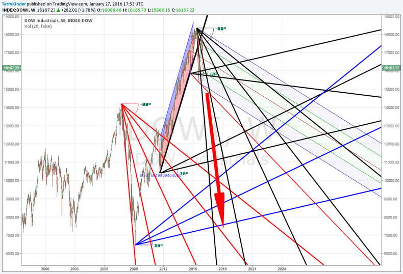
Dow Down the Elevator Shaft?

After a pretty sharp rise higher, as evidenced by the pink and blue shaded channel, it looks like the Dow is breaking down.
If the DJIA were to break above the red mid-line of the descending pitchfork it might be worth reconsidering that view.
However, the current Dow looks a bit like the big brother of the 2007 version, although the more important comparison is really to 1914 rather than 2007-2008.
If this time looks anything like 1914 (only upside-down) or 2007-2009, then expect to see the low wind up below the last significant pivot low right before the launch of the bull market.
That would mean a low below the blue line with the final low perhaps bouncing off the descending red line below it. Yeah, it's a long ways down.
Chart Analysis uses a combination of technical analysis and cycles to provide insight into the future direction of precious metals, currencies, stock indices and more.
