Plumbing the Depths of Gold
If you came to see this post expecting to be told exactly what you're looking at, which direction the market is going and how this chart works, you're going to be disappointed.
But, if you don't mind exploring new ideas, and plumbing the depths in search of a deeper understanding of the forces that move cycles, which in turn move prices, then you will be rewarded if you put in the work to advance your understanding.
These charts are built/based on several ideas/structures:
The Law of Vibration. Tony Plummer has done an admirable job sifting through the poorly understood law of WD Gann;
Fibonacci Numbers and things based on them including: - Fib Spirals, Fib Circles, and Fib Retracements;
Gann Square, Gann Box;
Geometry and geometric structures;
Natural Rates of Growth and Cycles including Phi, Pi, ratios, etc.;
The understanding that price charts reflect multi-dimensions rather than merely two;
The Pitchfan - a combination pitchfork / Gann Fan
Concepts of energy and growth, e.g. spirals and the Enneagram as a model for motion which shapes cycles
Octaves - related back to the concepts of cycles, vibrations, energy, the Enneagram and more...
So, there is plenty to keep you busy if you want to acquire a deeper and more meaningful understanding of not only prices and markets, but the forces influencing the wider world in which we live.
Switching gears to the more practical application of the above related to gold...]

The chart above highlights a previous gold market peak back in 1980. Take note of the 0.382 Fibonacci Level at $516.70. That may be something you want to examine more closely as it relates to the current market.
It's also interesting to simply follow price as it moves between the Pitchfans (series of lines originating from lower left and upper left of larger Gann Square. Also note how price reacts at various Fib Circle levels.

Looking at the more recent gold price chart there has been a noticeable spike higher in price. Some say that a new and durable bull market has started. There are some smart people with various opinions. One viewpoint is expressed by the very insightful Peter Temple in his post Closing the Gap (scroll down his post to find the video link which addresses gold). Peter sees gold going up to $1,600.00 or so (in an undisclosed time frame) before dropping down to below $800.00.
Such an outcome would be dissimilar to what happened back in 1980 - take a look at that 0.382 Fibonacci Level at $516.70 again. Now compare it to the current chart 0.382 Fibonacci Level at $1,389.00.
While there is no rule that the past must be prologue, there are enough similarities between the 1980 gold chart and the current one to at least make an argument that a break above $1,389.00, and certainly higher than $1,600.00, will constitute a very different energy level and set of circumstances. That in no way says that a move to $1,389.00 or $1,600.00 can't or won't happen, but it would almost seem to require something so powerful as to reset all cycles. Again - never say never. [Another more mundane possibility would be that both the 1980 gold and current market charts are simply constructed incorrectly. We should have a clue soon enough as the expectation would be for the gold price to move lower as it nears the center of the chart. If it doesn't, then it would be time to re-think its construction.]
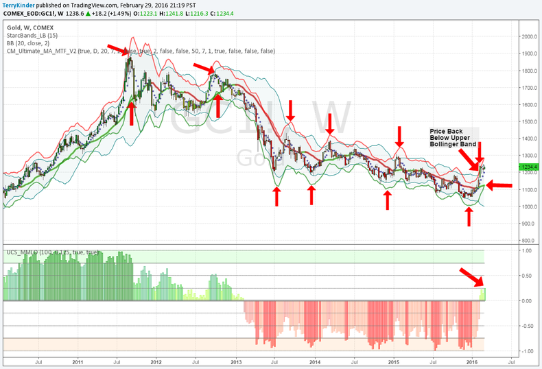
A short-term argument against the gold price running up much further is the chart below.

Notice how the green STARC Band has crossed up into (perhaps above) the mid-Bollinger Band. The last two times this happened, that are visible on the chart, price dipped fairly substantially over time.
The counter-argument is that, if gold has switched to a strong bull market then there could be a temporary reversal in price followed by further progress higher. Again, this remains to be seen and it bears noting again that the 0.382 Fibonacci Level at $1,389.00 should provide a clue whether the current move is temporary or, perhaps, more durable.
Another interesting aspect of the above chart is the bottom indicator (highlighted by the red arrow) which turned positive on a weekly basis for the first time since 2013. It's still negative on a monthly basis (not shown), but the green bars are not something we should ignore.
So, despite the impressive move higher in the gold price, it remains unclear that this move represents either a definitive reversal of the trend over the long-term or a price bottom has been achieved.
A Final Note: Just as this piece was being completed, noticed that Martin Armstrong pointed out that a private post was available regarding gold at his Socrates site.
You can access Socrates here by registering. If nothing has changed, there was previously an option to register for a one-month trial for $10.00 - it's well worth it.
While we won't reveal what was posted on Armstrong's Socrates site regarding gold, the important level we noted above is in the ballpark and it looks like March, as was February, could prove to be another interesting month.
Chart Analysis uses a combination of technical analysis and cycles to provide insight into the future direction of precious metals, currencies, stock indices and more.
