
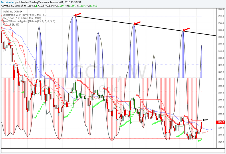
Gold Waterfall Decline
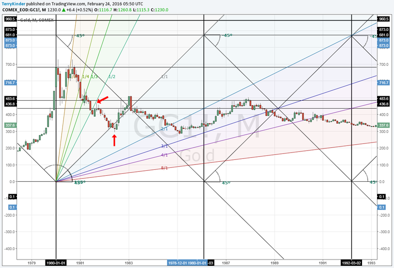
Lost in the excited chatter about the move of gold to above $1,260.00 by the many gold salesmen was any historical perspective or insightful technical analysis.
Generally, those with a vested interesting in selling the retail public the shiny metal want to sell it today and will twist the chart into whatever golden pretzel . . .
Gold: Fooled Again?
The almost constant predictions of either new record high gold prices or bottoms have been a constant source of wonder since 2011.
It now appears we're facing another moment where both true believers in gold and the people who love to sell them the shiny yellow metal will believe (or perhaps not the ones urging the purchase of . . .
SP500 Finding Support (For Now)
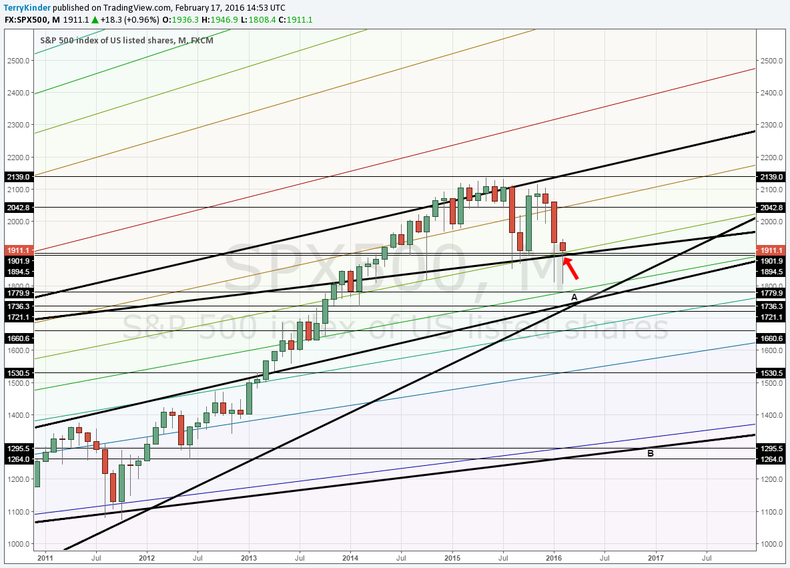
On January 26th we discussed the possibility of a sub 1,400.00 sub 1,400.00 SP500 by the end of 2017.
However, it looks like before that happens, we're likely to see a counter-trend move first.
Flipping back to our first chart, there are four support lines, between roughly the 1,895.00 to . . .
Gold May Be Getting Interesting
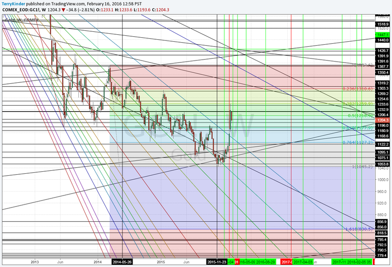
The situation with gold appears to be getting interesting. However, despite calls by some of a gold bottom, it is likely too early to say that the low has been achieved.
Above is an experimental chart. Have been looking over the past few days at some different methods to determine support and resistance levels as well as . . .
Dow Jones Pattern Forming
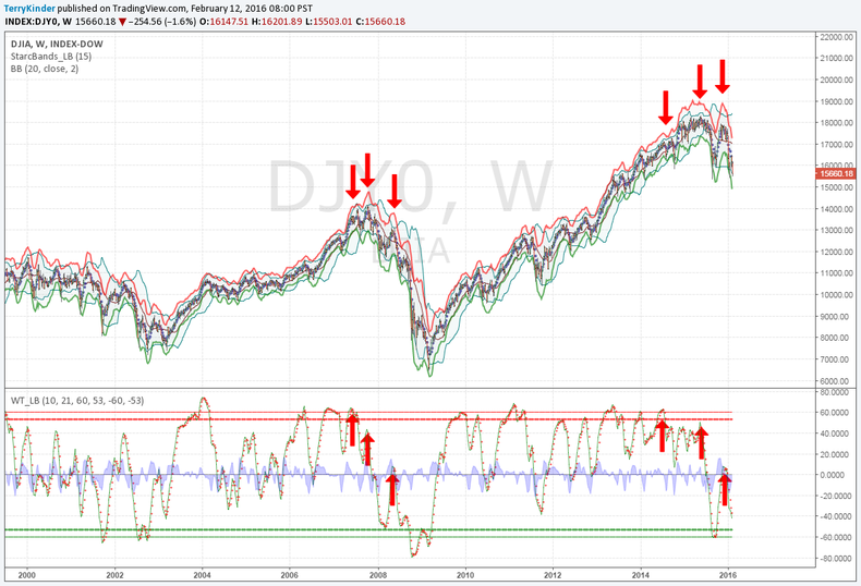
A somewhat similar, but not exactly repeating pattern, has been developing in the Dow Jones Index.
Essentially we are looking at a topping pattern. This pattern involves three chart indicators as elements:
Starc Bands (red and green bands around DJIA levels (price);
Bollinger Bands (shaded area around DJIA . . .
A Few Gold Charts (Waiting for the Next Great Bull Market)
With the gold price haven risen recently, it's a good time to take a look at a few charts and also discuss some basic chart construction / philosophy.
Essentially all of the charts constructed here are based around a few basic ideas:
Prices, among other things, are cyclical;
Price encapsulates . . .
Dow Boom Turning to Bust
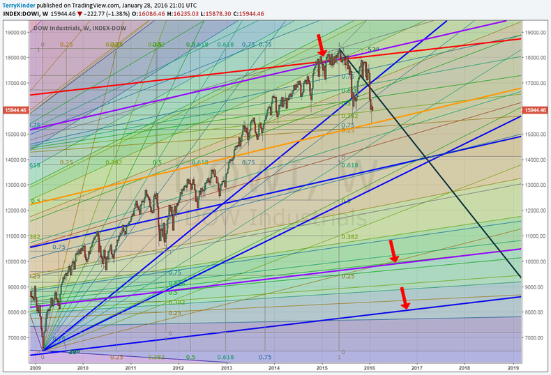
The Dow Boom is in the process of turning into a Bust.
Although the above chart is a bit busier than many might like, it's worth taking a moment to dig into it.
At the top red arrow there is a confluence of interesting signals near the all time high of the Dow:
The Dow attempts multiple times to . . .
Cover image credit: http://pixabay.com
